Car transport in Utravs
What I've done
Portfolio
Goals and Challenges
- Providing train ticket sales services for car transportation.
- The expansion of tourism services in the field of train products.
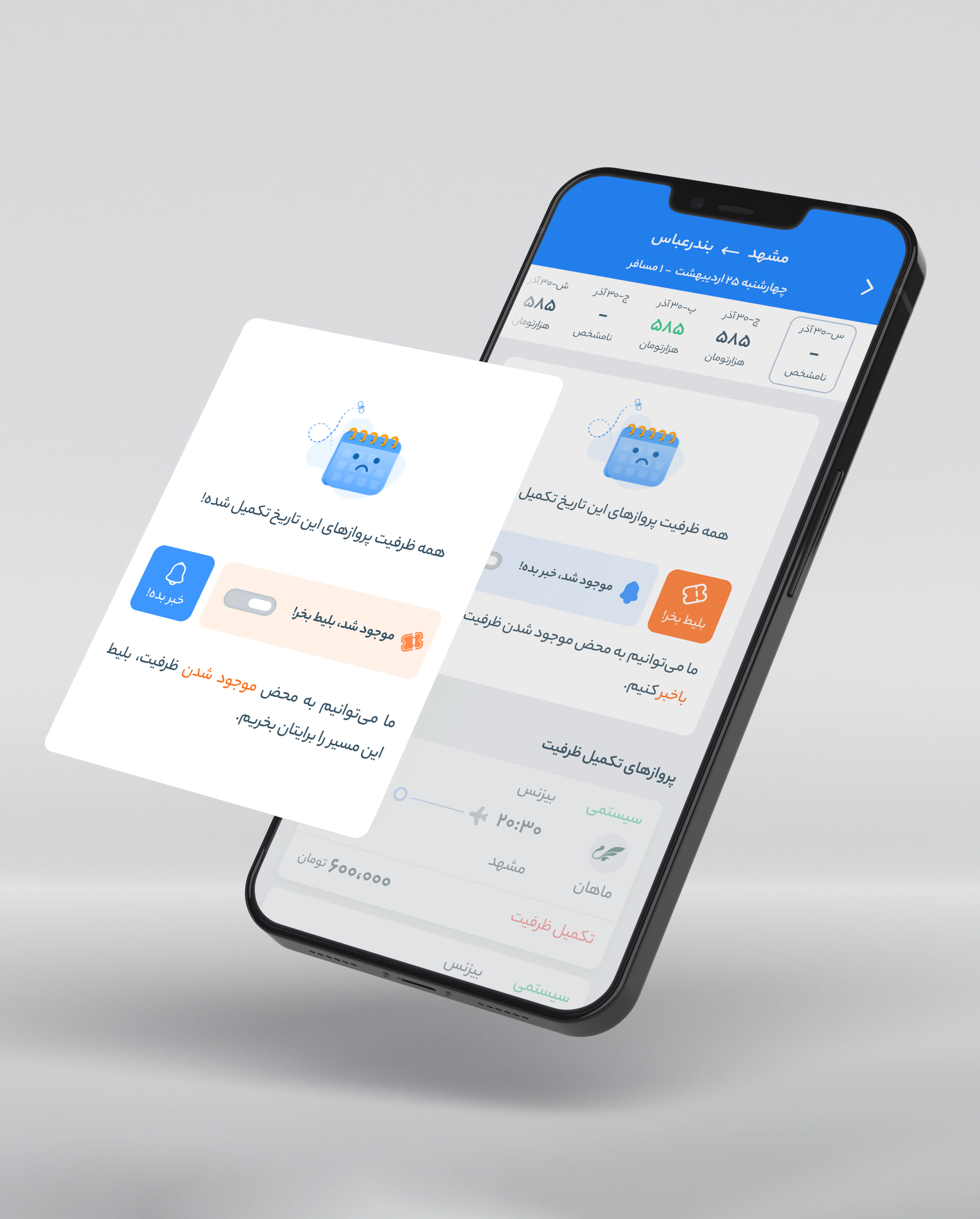
- How to display and place the new feature.
- Eliminate the possibility of errors in users when buying tickets.
- The problem of registering license plates of people with disabilities.
- Ensuring that users read the rules of car transportation.
.jpg)
Solutions
- Clarify the transportation ticket compared to the normal travel ticket for users,
using appropriate changes in the user interface.
- Full and clear display of car transport rules and receiving confirmation of reading
from users due to the high sensitivity of the rules.
- Easier registration of car license plates of people with disabilities by separating
the selection of this license plate from normal license plates.
- Creating a suitable user experience.
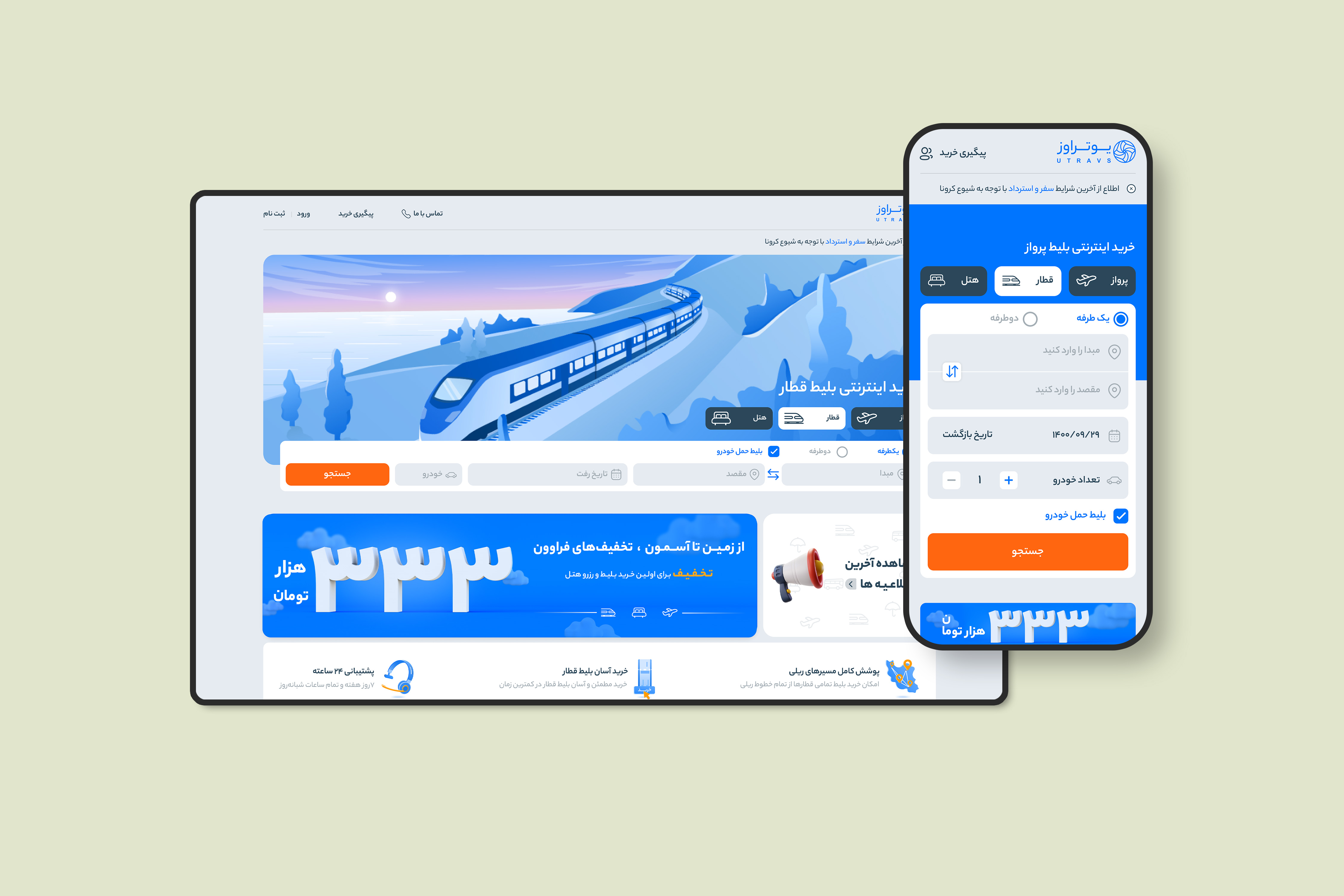
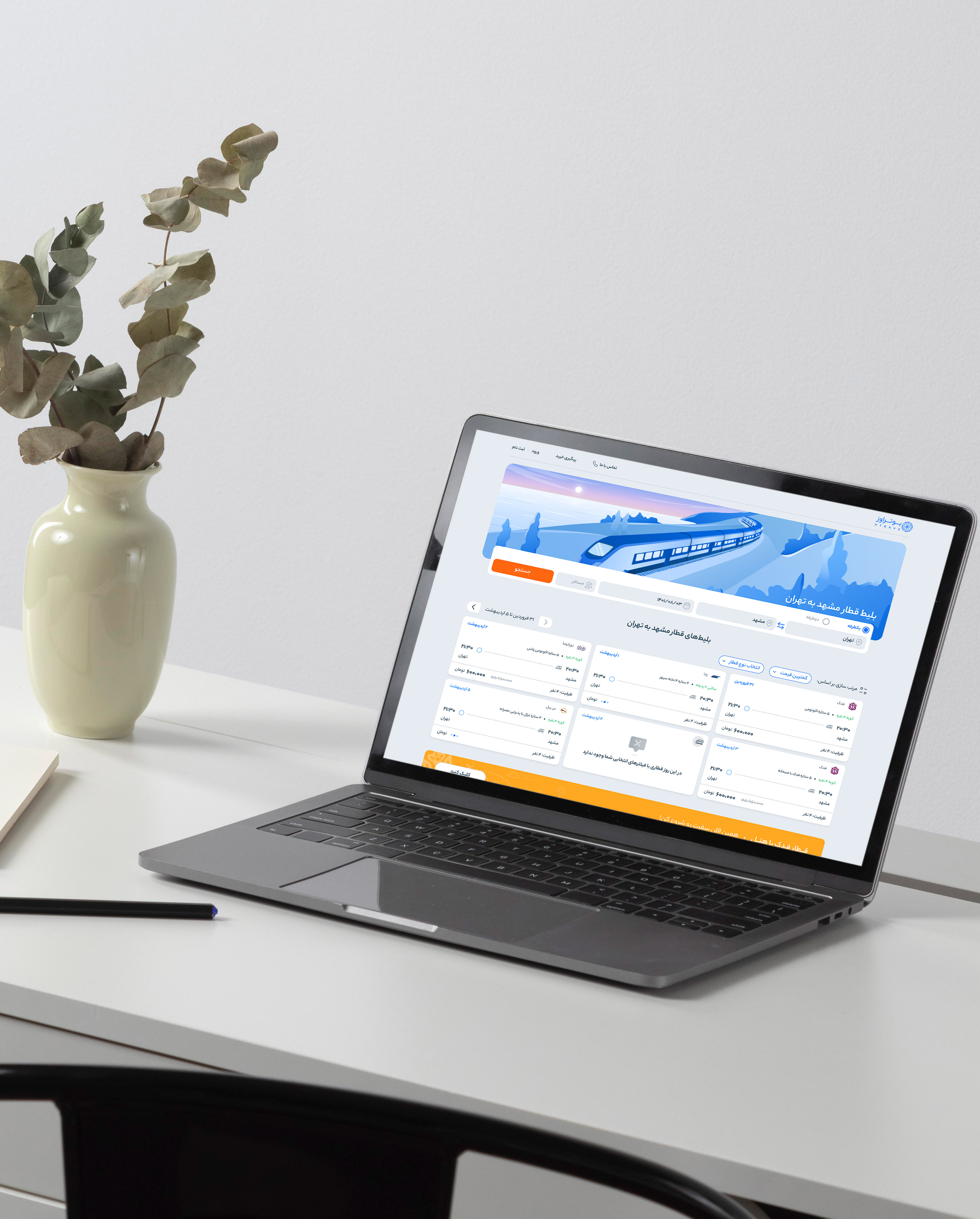
The design of the car transport feature was done to make train product services
comprehensive for users and to create a suitable user experience while buying tickets.
At first, by checking this feature on competing sites, we analyzed the positive and negative points
of this feature on other sites. Also, by examining the persona of the train product, we understood
the needs and goals and pain points of the users about this feature.
The user flow was designed for this feature and after the approval of the product manager
and the design team leader, we entered the process of designing the user interface.
By creating the "car transport" tag in the ticket cards, specifying
the number of cars and separating this feature from the normal ticket
purchase flow, we tried to avoid the possibility of errors and mistakes in the purchase process.
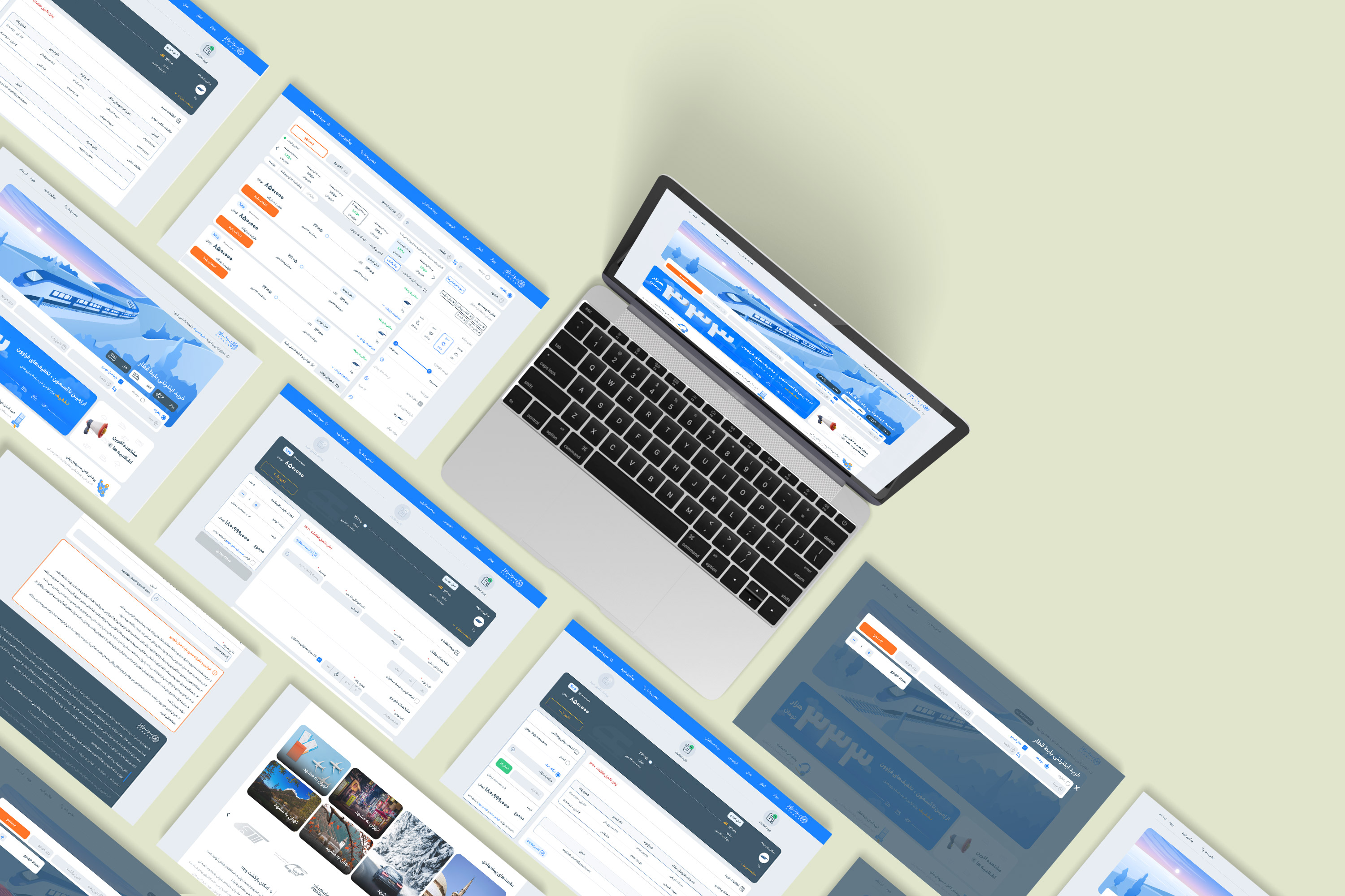
The design of this feature was done for the UTravs website and application.
My Work
Read My Other Cases
My Work
Automatic ticket purchase
The automatic ticket reservation feature is one of the attractive and widely used features in the field of tourism. We went through unique challenges to design the MVP version of this feature.
Exclusive train landings
Some users entered UTravs through Google search. In order to properly direct them to the train ticket results page, and to make it easier to choose and buy tickets, we decided to redesign the old landings of the site.
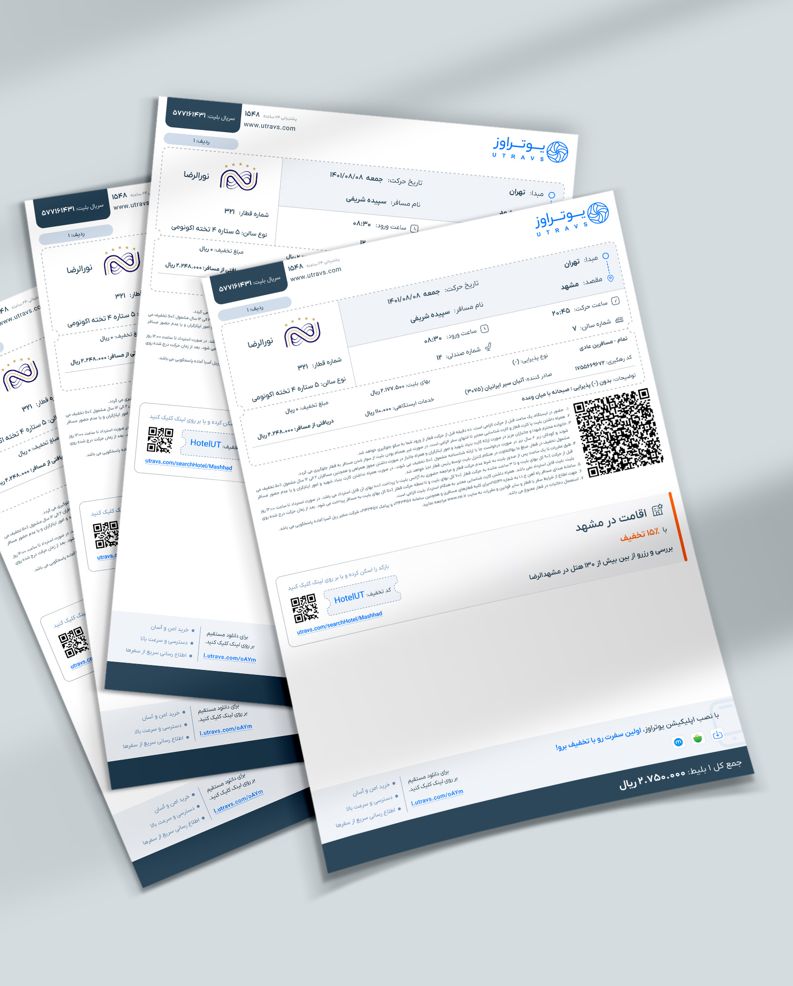
Train Ticket Redesign
The purpose of the train ticket redesign was to increase the readability of the texts, improve the user experience, create cross-selling between the company's products and make the corporate brand last in the minds of users.
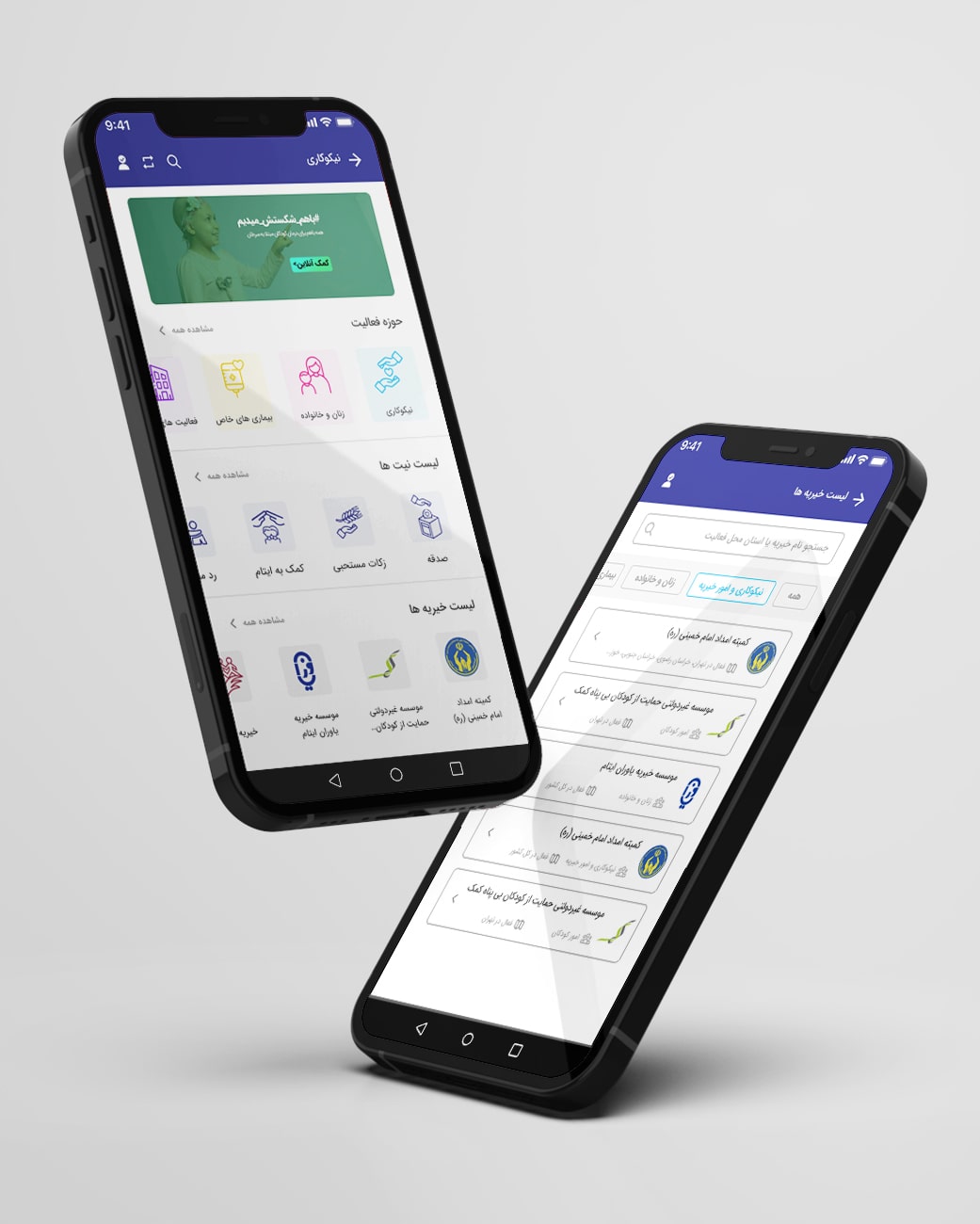
Charity, Badesaba App
For the redesign of the charity section in the Badsaba App, we've first examined the strengths and weaknesses of all apps with a charity section through competitive analysis.
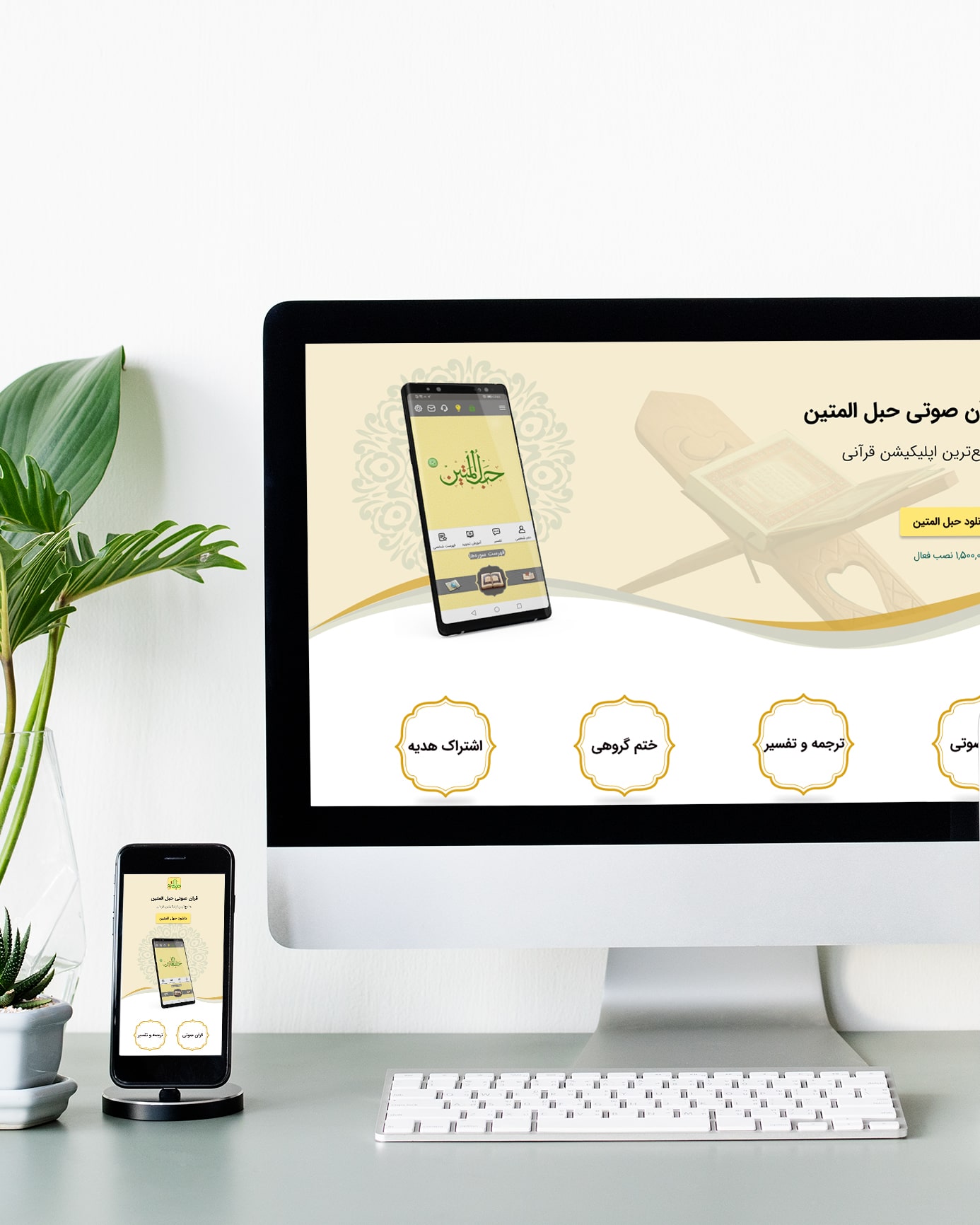
Hablol-Matin website
The purpose of designing this site was to provide users with quick and easy access to the Hablol-Matin application and to familiarize users with the features and facilities of this application.
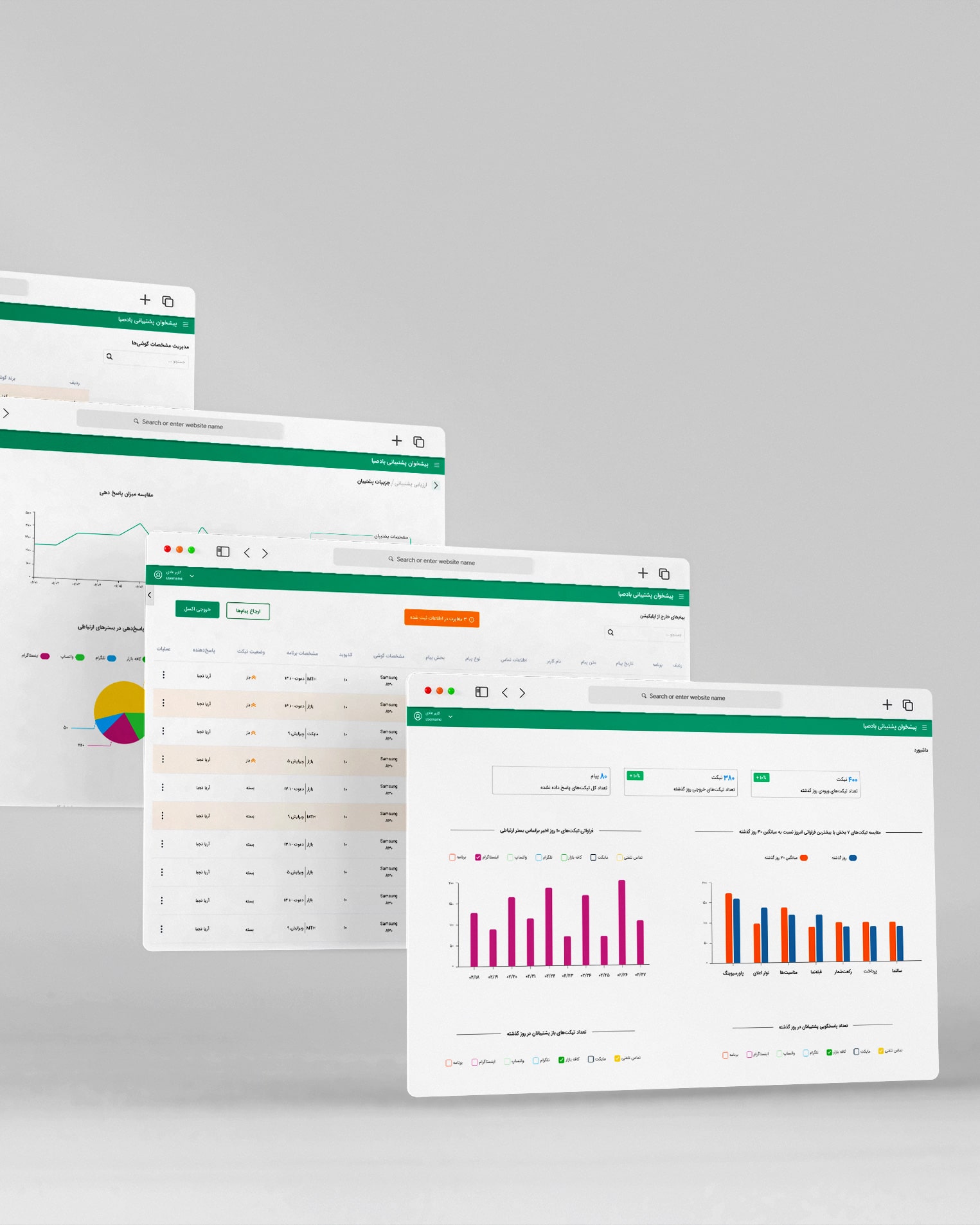
Badesaba CRM Panel
To design the communication panel with customers, first of all, meetings are held with the stakeholders of this panel unit, i.e. collection support, to understand their needs and challenges in registering and maintaining active tickets.
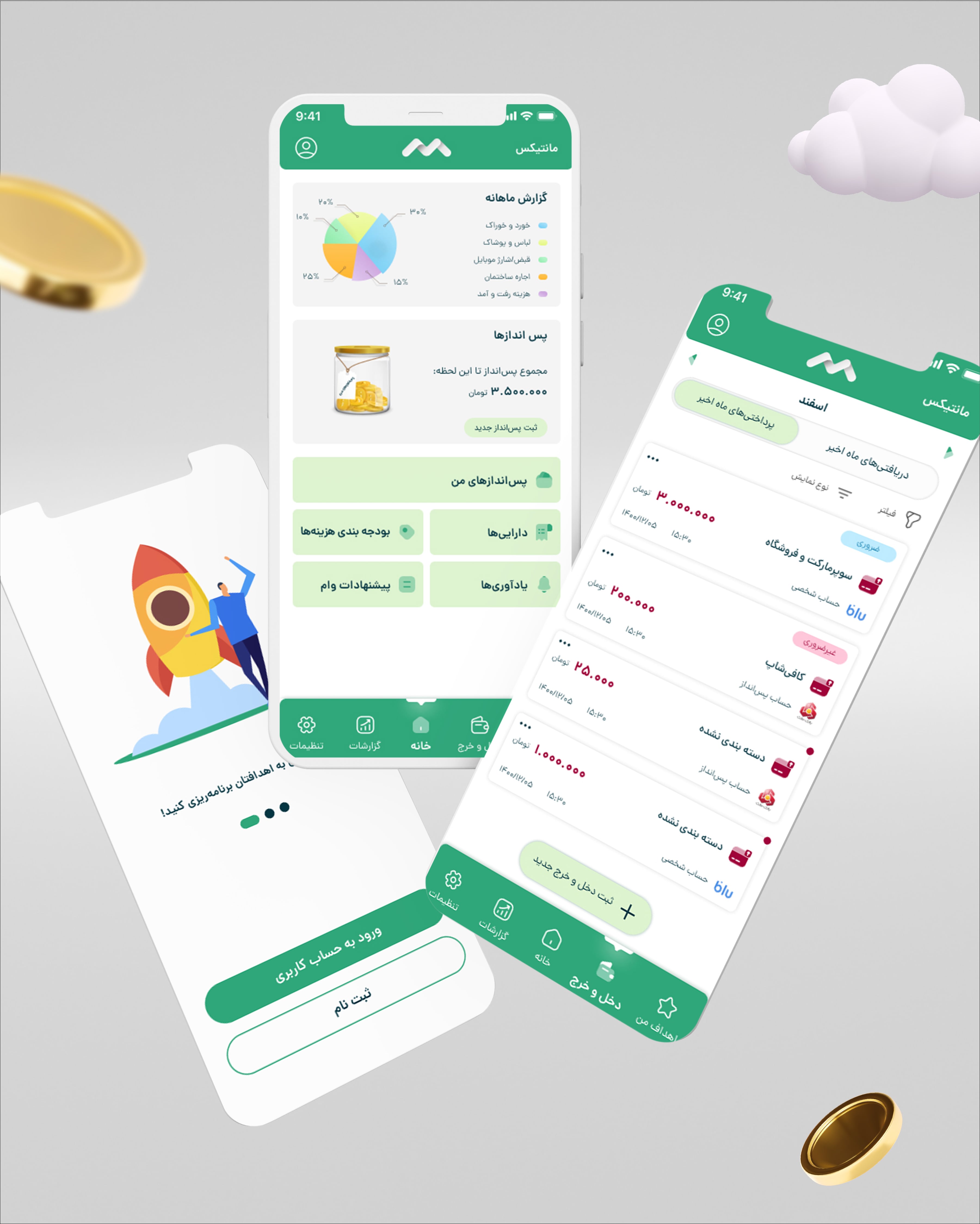
Monetics Case Study
This project started by examining the basic assumptions in the field of savings and financial planning. In this context, I designed questions to interview a small part of the target community. I conducted this interview with five people in person and online.
Badesaba Chrome Extension
To design the Badsaba chrome extension, we checked about 20 internal and external extensions and analyzed their features in the competitive analysis table.