Exclusive train landings
What I've done
Portfolio
Goals
- Correct guidance of users who entered the UTravs site through Google search.
- Increasing the SEO rank of the site.
- Providing users with useful information about trains and tickets.
- Directing users to train results pages and helping them find the right ticket.
Solutions
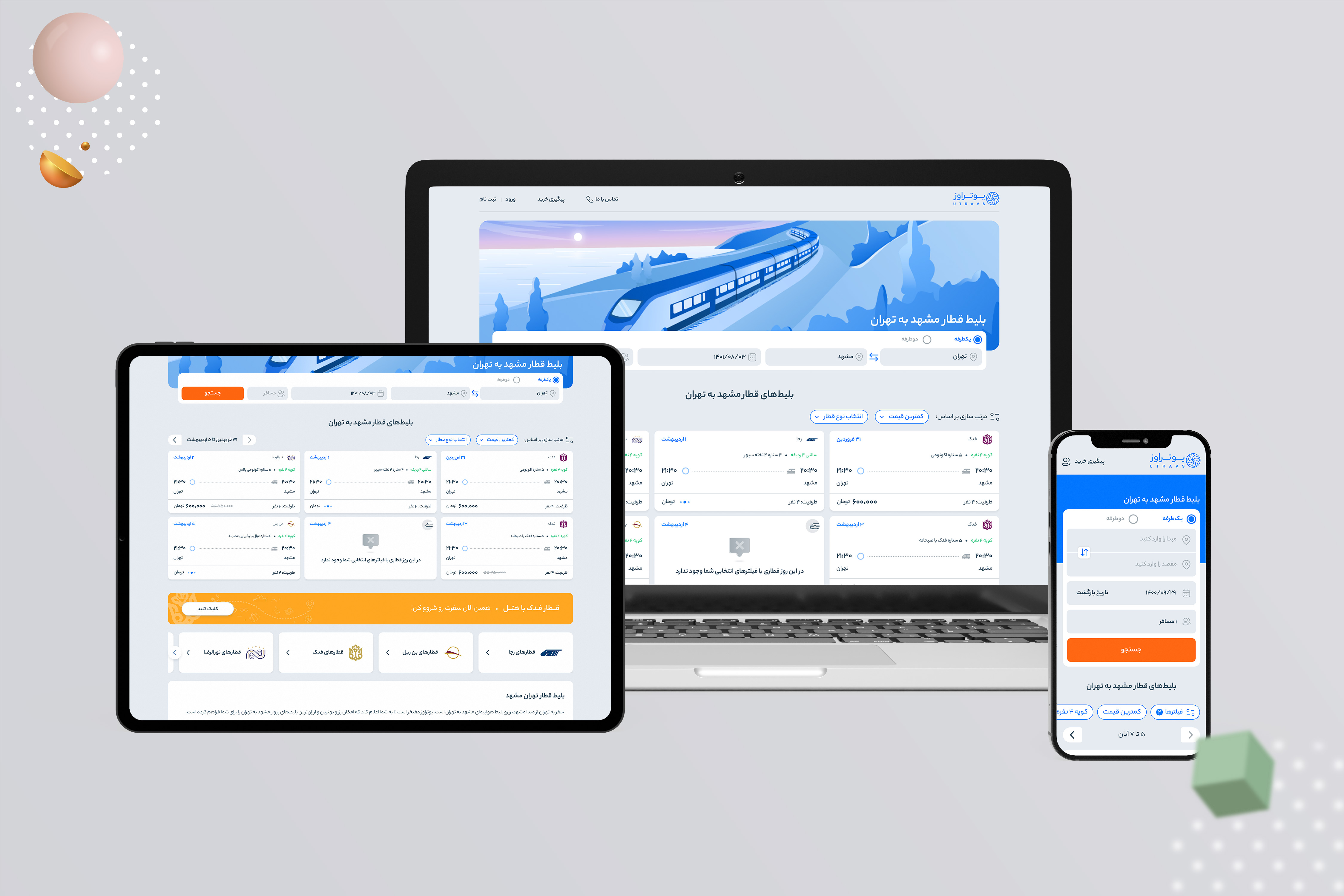
- Using the ticket offer section under the main search bar to help users choose the ticket they want.
- Putting a filter in this section to personalize tickets by users.
- Modifying the grading and size of the elements of the old designs of these landings.
- Creating appropriate sections for linking between pages to improve the SEO of pages.
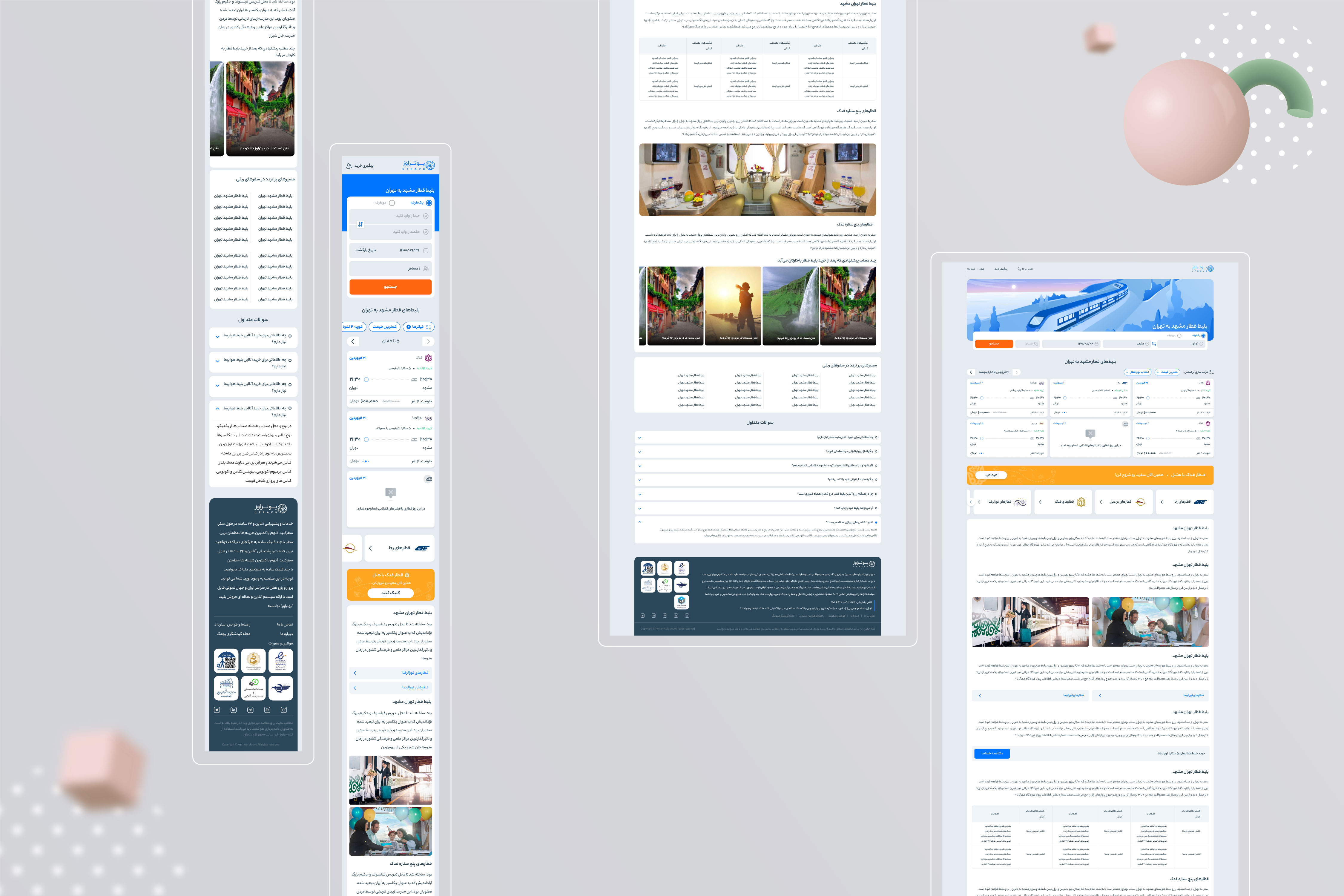
Our personas for the design of these landings were users who searched for the name of the train or their desired origin/destination in Google search.
In order to direct these users to the train ticket results page, and to make it easier to buy, we decided to redesign the old landing pages of the site.
For this, we first held meetings with the train product manager to understand the main requirement of the product team.
After that, we held meetings with the marketing team to check their requests to improve the SEO of the landing pages.
Dedicated train landings were also reviewed and analyzed on competitors' sites.
Finally, after understanding the needs of the users and the needs
of the company, the Lo-Fi wireframe was designed and after the approval
of the product manager and design leader, the user interface was designed.
My Work
Read My Other Cases
My Work
Automatic ticket purchase
The automatic ticket reservation feature is one of the attractive and widely used features in the field of tourism. We went through unique challenges to design the MVP version of this feature.
Train Ticket Redesign
The purpose of the train ticket redesign was to increase the readability of the texts, improve the user experience, create cross-selling between the company's products and make the corporate brand last in the minds of users.
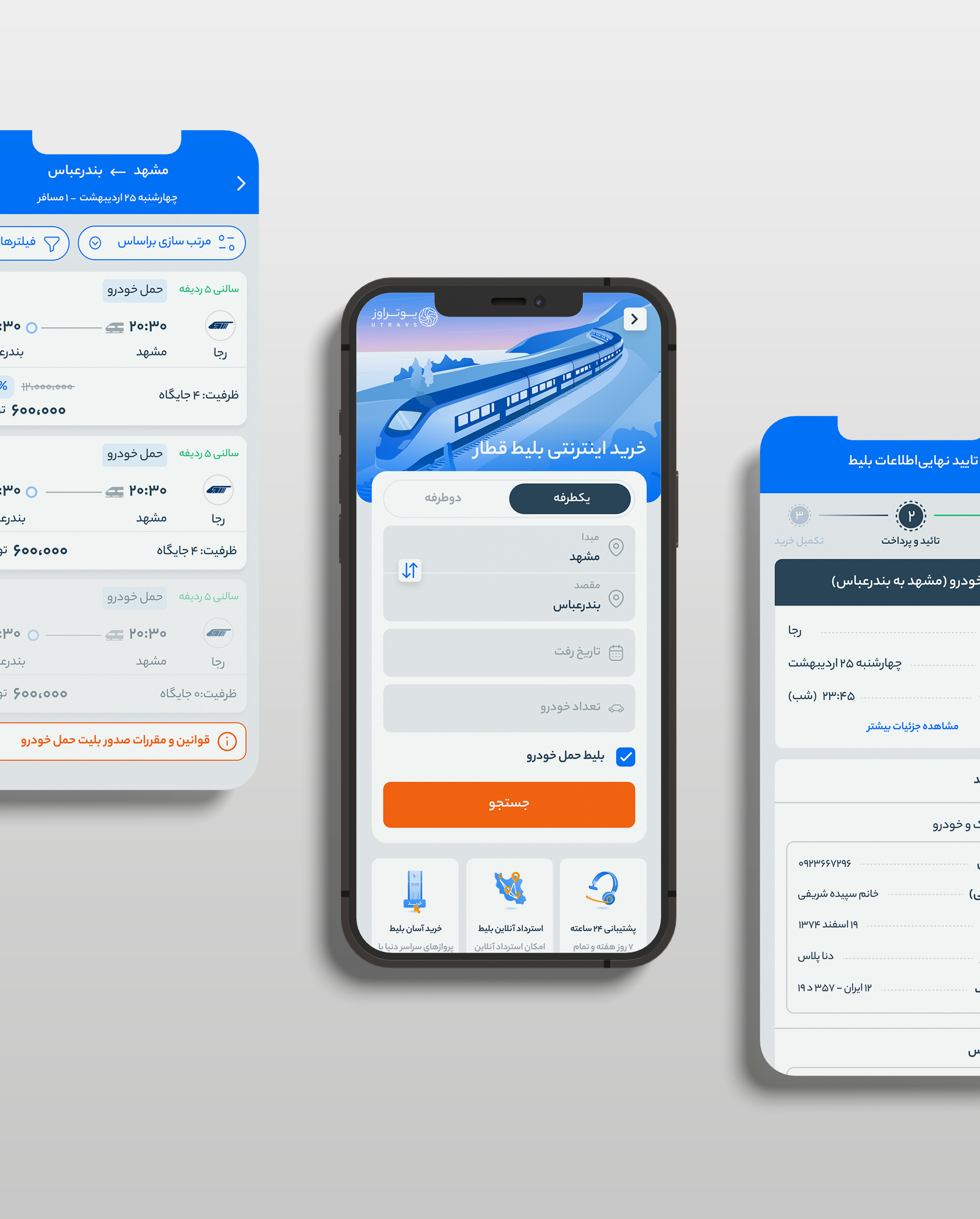
Car transport in Utravs
Car transportation feature was designed to complete train product services for users and to create a suitable user experience while buying tickets. The feature was designed for both the Utravs website and application.
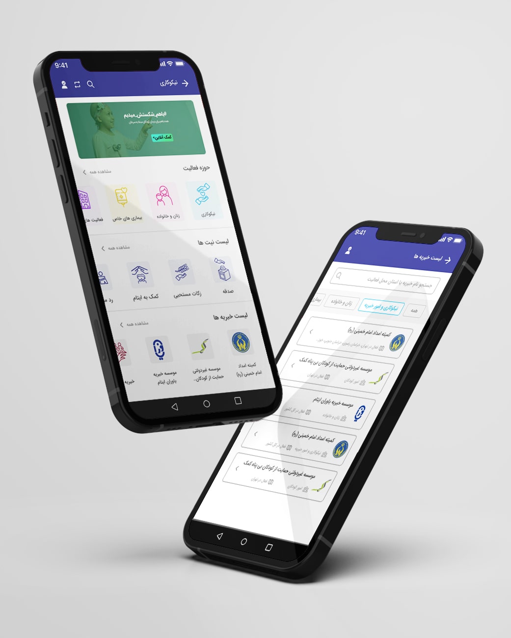
Charity, Badesaba App
For the redesign of the charity section in the Badsaba App, we've first examined the strengths and weaknesses of all apps with a charity section through competitive analysis.
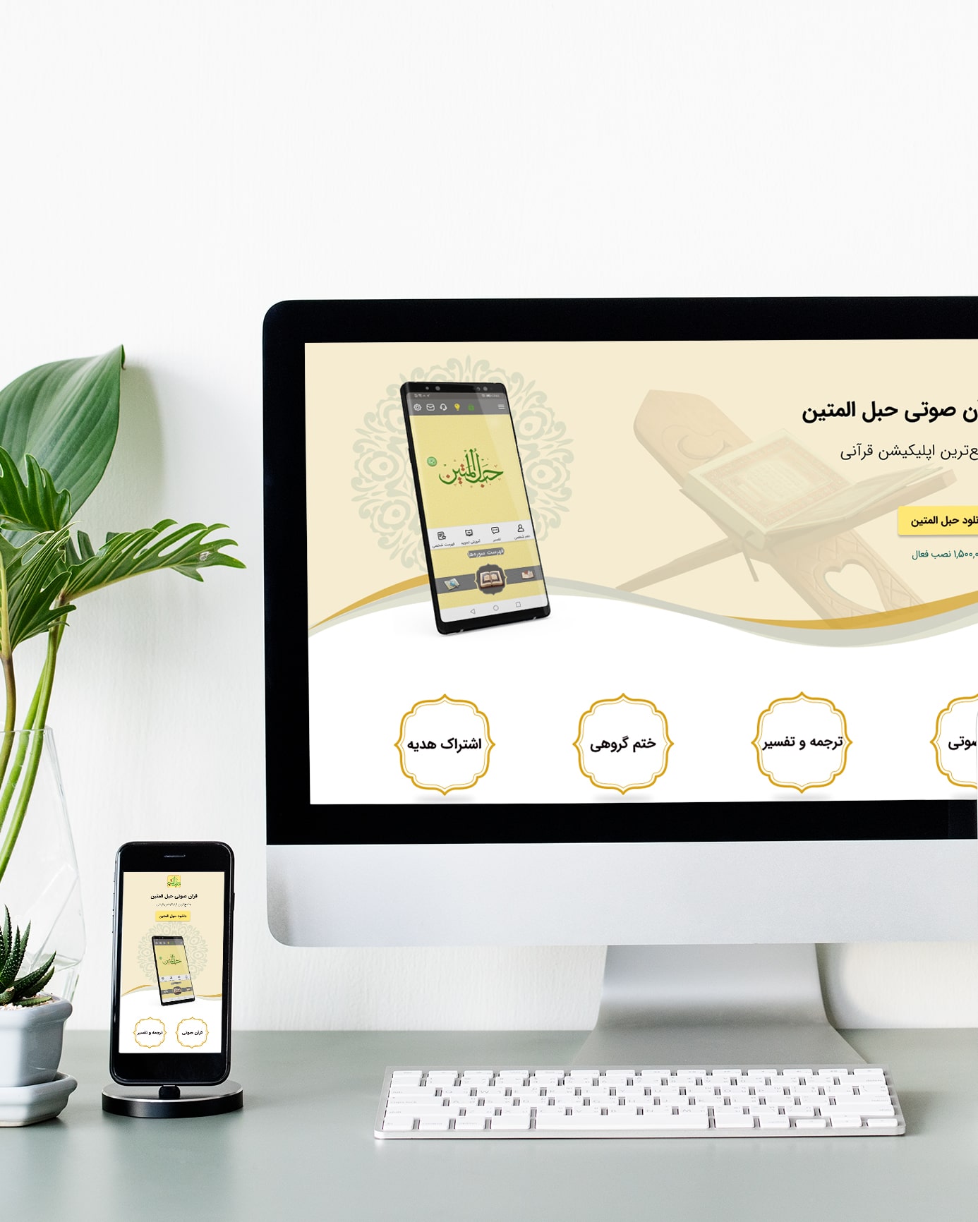
Hablol-Matin website
The purpose of designing this site was to provide users with quick and easy access to the Hablol-Matin application and to familiarize users with the features and facilities of this application.
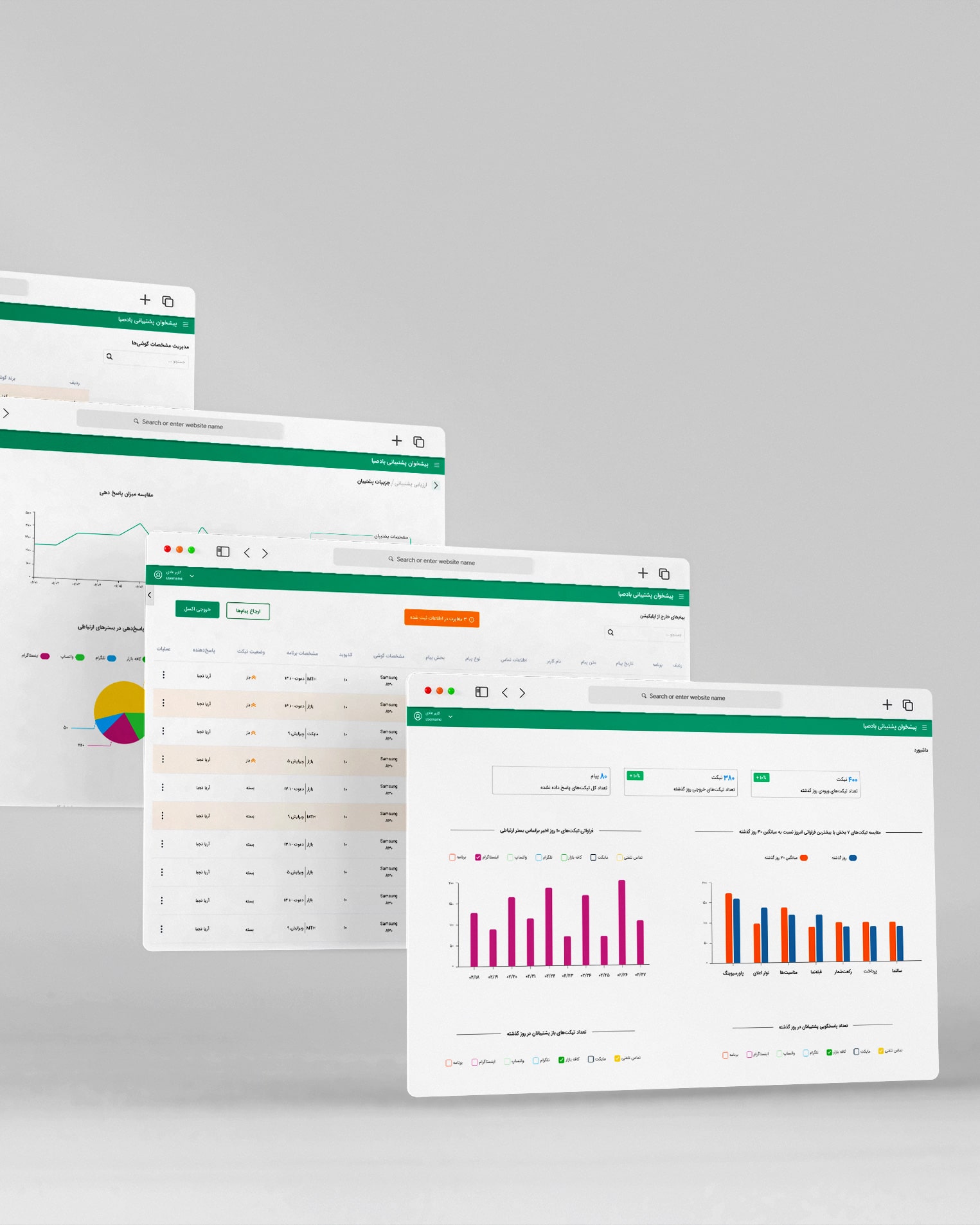
Badesaba CRM Panel
To design the communication panel with customers, first of all, meetings are held with the stakeholders of this panel unit, i.e. collection support, to understand their needs and challenges in registering and maintaining active tickets.
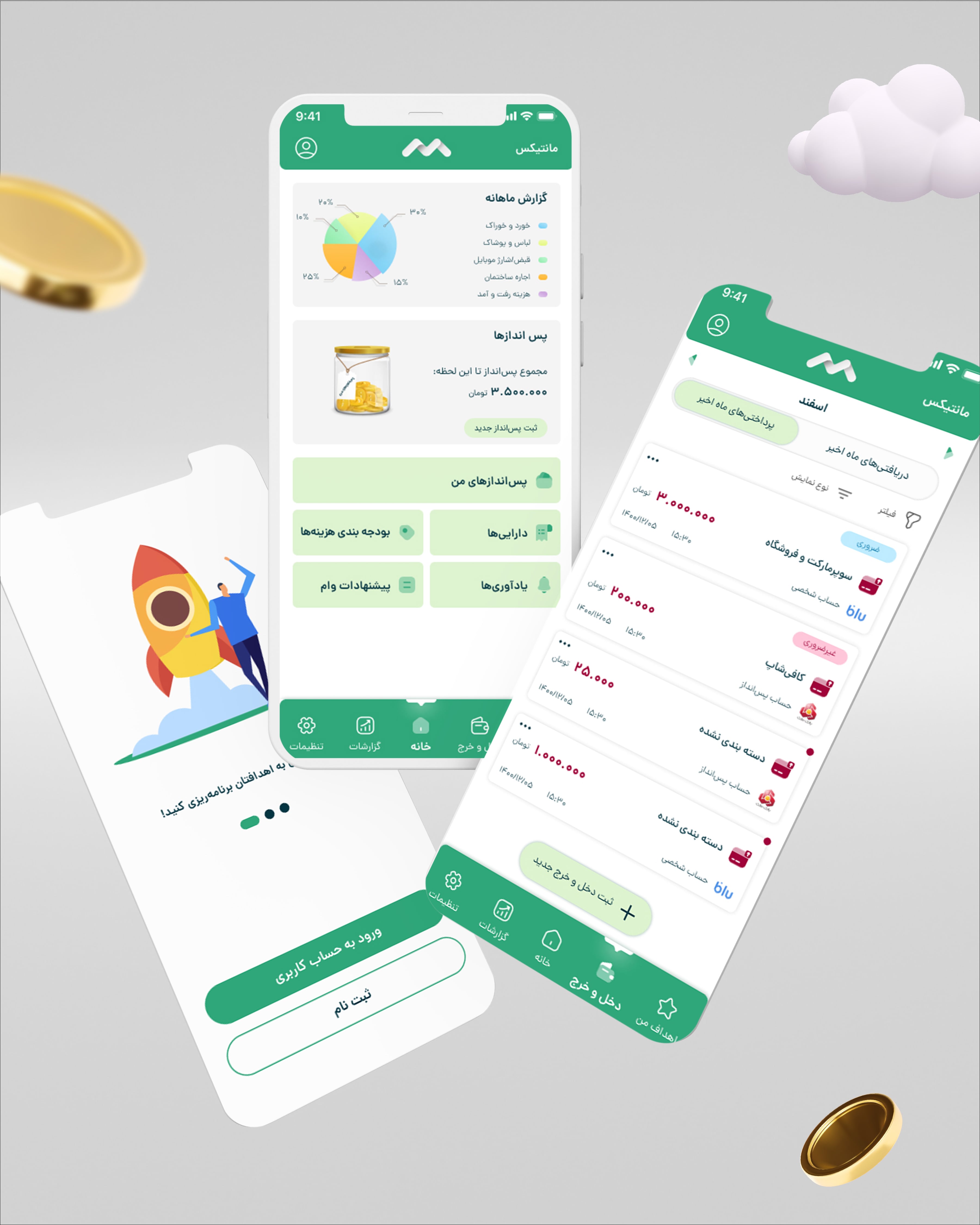
Monetics Case Study
This project started by examining the basic assumptions in the field of savings and financial planning. In this context, I designed questions to interview a small part of the target community. I conducted this interview with five people in person and online.
Badesaba Chrome Extension
To design the Badsaba chrome extension, we checked about 20 internal and external extensions and analyzed their features in the competitive analysis table.